
II’m writing a novel in InDesign—that is, writing and arranging the layout at the same time. I’ve been researching the history of page layouts, not only in the current age of desktop publishing and its modernist precursors, but in various premodern and non-Western cultures. The idea is to repurpose complex layouts for use in contemporary experimental fiction. How, for example, can the rhetorical aims of medieval glosses be used for contemporary experimental fiction? How can InDesign and other current resources move the practice of the novel forward? Can multiple columns embody the postmodern interest in the divided self? Are nonfiction experiments like Derrida’s Glas related to the current concerns of fiction? Can it be useful to echo well-known page layouts like the Talmud or medieval commentaries in a contemporary text? Can marginal notes be an opportunity for the narrator to speak about their own text? How many voices can a page of fiction embody?
The posts are:
Surrounding text with commentary
Along the way I will offer critiques of formatted texts by Danielewski, Butor, Michaux, Schmidt, Fritz, Brooke-Rose, Derrida, Lebensztejn, and others. My interest here doesn’t include pages presented as images, as in concrete poetry and artists’ books, but rather pages where the formatting contributes to the meaning of the narrative. A formatted page, in this understanding, can be put into other fonts: what matters is the relation between the text elements—how they speak to each other and to the history of abnormally formatted texts.
My theme in this first post is commentary that appears on the same page as the main text. It’s an intriguing possibility for fiction, because the page can be divided into main narrative and running commentary. Coetzee’s Diary of a Bad Year does something like this with its three simultaneous narratives.

In the middle ages a primary text (the Bible, or a classical author like Aristotle) would be “glossed” on the same page in smaller handwriting.
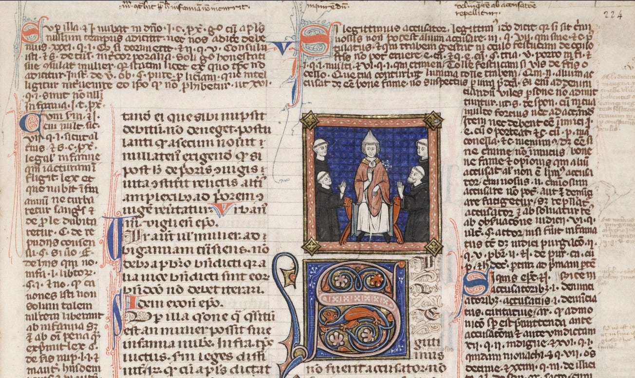
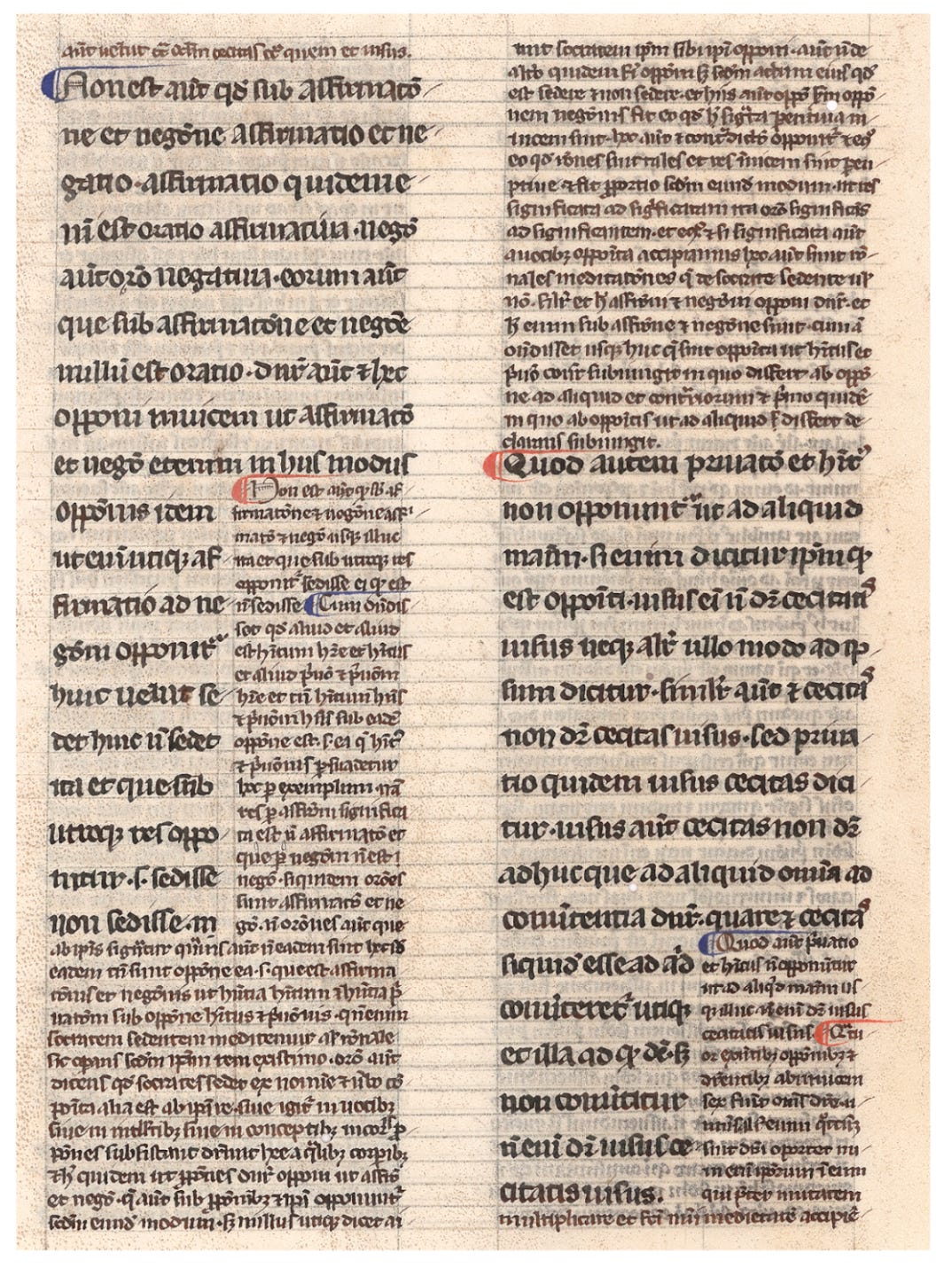
Glossa ordinaria is the general term for this practice in editions of the Bible: it denotes a compendium of commentaries, first assembled in the 12th century, that accompanied Bibles until the humanistic reforms of the 15th century and the Reformation of the 16th.1 In terms of layout, there are two principal models, which present different possibilities for fiction. In the image above, the gloss surrounds the main text. The other principal possibility is that the commentary invades the “body text,” as it’s called in typography, interrupting the flow of narrative, as in both the left and right columns here.
That’s quite different from being surrounded by commentary. For a fiction writer it means that the main story can be repeatedly interrupted by some other voice—for example the narrator, having second thoughts, or another person’s viewpoint.
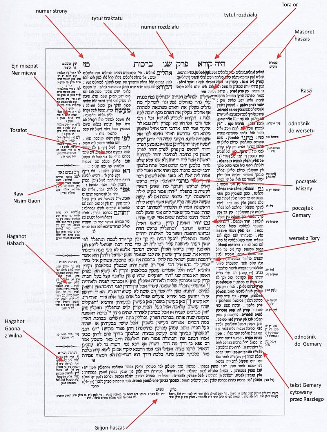
The first kind of gloss, which surrounds the body text, can also be found in various forms of the printed Talmud.
In this case it’s not actually the primary text that’s surrounded. Here that would be the Torah, but it is not reprinted in the Talmud. The central block on a typical Talmud page is comprised of the Mishnah (a commentary on the Torah) along with sugyot (passages) from Aramaic commentaries on the Mishnah called the Gemara. In this Polish graphic, the transition from Mishnah to Gemara is annoted on the right, “Miszny” and “Gemary.” So what appears as the primary text, in the center, isn’t actually primary: it’s already secondary (the Mishnah) and tertiary (the Gemara). The possibilities for fiction are dizzying: in fiction, this could be stories about someone who is absent from the text, in multiple layers, Rashomon-style.
And that’s only the beginning, because draped around that central block there is more commentary: the Tosefta on the left and Rabbi Rashi’s commentary on the right. Minor commentaries and cross-references are farther out in the margins.
In all these examples, the primary text is venerated, enriched, and defended by commentary. In my own writing project, I have the opposite idea. The opening chapters in my novel—called Stories, Like Illnesses, due out in 2026 or 2027—are formatted in the usual way, just body text margin to margin. As the novel progresses, the narrator’s life becomes more difficult. Distractions in his life start appearing in columns and surrounding text, like in these examples. They’re things he’s thinking about while his life is veering off course: what people have told him or written to him, books he’s been reading, and fantasies that help him get through the day.
The compendia of medieval scholarship called glossae ordinariae are there to protect and defend the Biblical text, but in my project they are at first defenses, and later antagonists. In historical terms, the added texts work at first like pre-Reformation glossae ordinariae, protecting the main text, but then they appear as the Reformers saw them, as attempts to suffocate the text, and keep it away from direct contact with the reader.
Toward the end of the novel the disturbances in his life become extreme, and the main narrative is surrounded by small-print “commentaries” like the Talmud page. The body text is squeezed, compressed into a small area in the middle of the page. I call the surrounding texts suffocations rather than glossae ordinariae, which is too pious, and I call the added texts that are inside the body text interruptions. The pages are meant to be pictures of the character’s mental state.
How complex can all this get? When the arrangement of folio pages got too intricate, medieval Christian scholars used signes-de-renvoi: symbols in the primary text, repeated in the glosses, to show readers how to nativage from a given passage to its commentary. These were often in red and blue, as in the Aristotle commentary above. The Douay-Rheims Bible (1582/1635) is an example of the use of signes-de-renvoi, and it even includes a little key to its signs, which is written in an entertaining 16th century English:
These foure pricks ∷ shew that there is an Annotation in the margent [etc.]
Signes-de-renvoi were also done as calligraphic swirls of red and blue, and there were lemmatic glosses, which were underlining in the main text and glosses that could lead readers through the page. (An excellent source here is Anna Somfai’s “Medieval Manuscript Layouts,” 2024.)
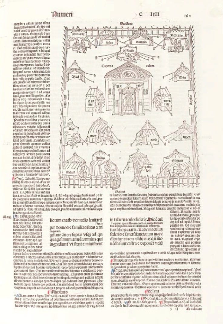
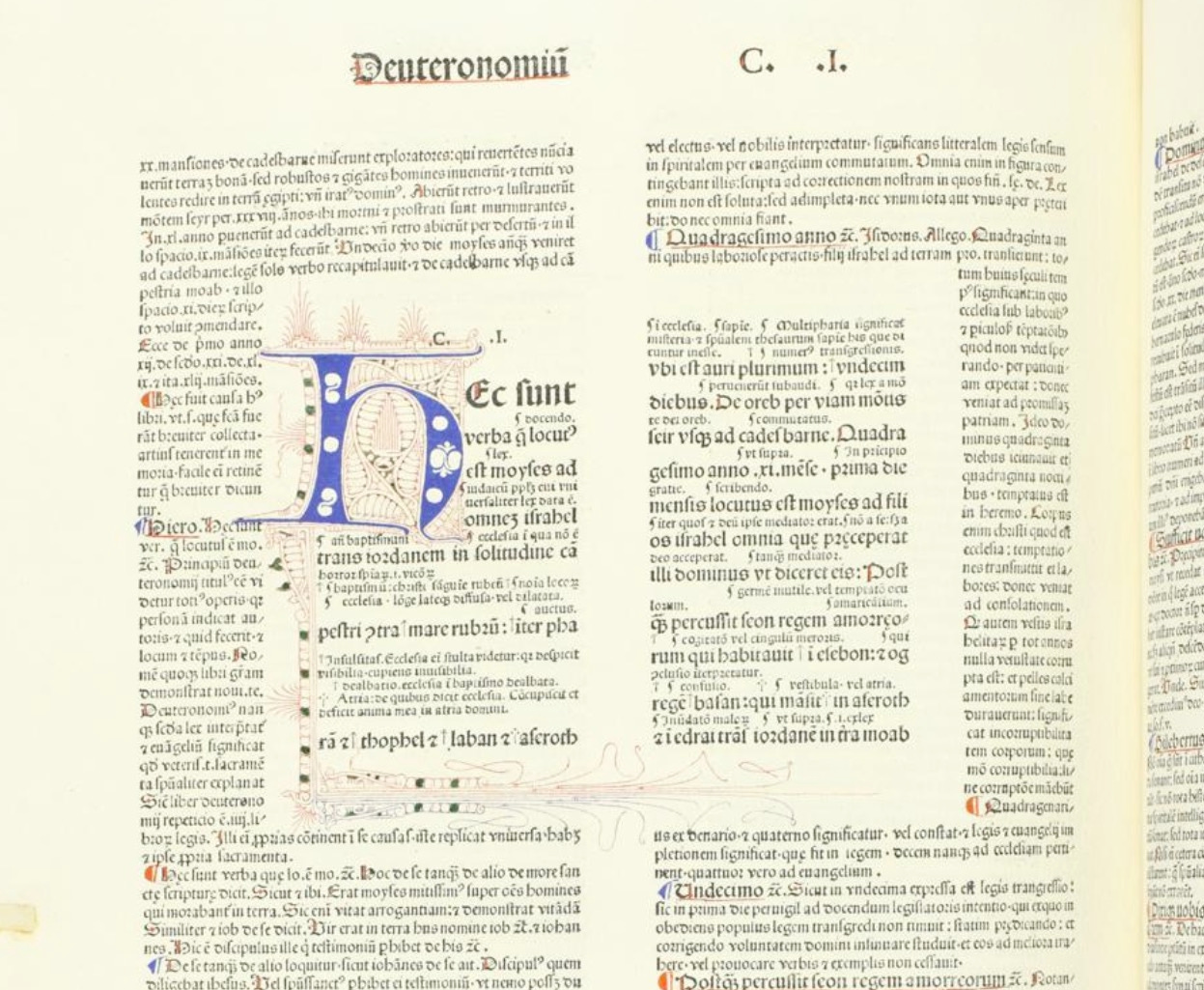
There is also a third form of glossa ordinaria, in which the gloss inserts itself between every line of the main text, creating Bibles with interlinear commentary, surrounded by more commentary. Here is a page from a Latin Bible published in 1495. In the middle is a passage from ther Book of Numbers, with small-print interlinear commentary, entirely surrounded by the glossa ordinaria. (And a picture of the Israelites’ tabernacles.)
I haven’t thought of a way to use this in fiction yet, but Eimear McBride comes close in the small print in her novel The City Changes its Face.
There are even passages where the interlinear commentary bursts its usual bounds, the way the painted ornamentation does. (On some pages, in some copies, the ornament makes use of the gutter all around the Biblical text, exactly like a vine growing between stones in a wall.) Here, at the opening of Deuteronomy, the smaller interlinear commentary sometimes overlows the end of the line and continues, after another line from Deuteronomy, forming a separate text flowing between the lines of the Biblical text.
In the Chinese tradition, Ming and Qing commentaries took the form of double-line characters (half the width of the primary text characters).
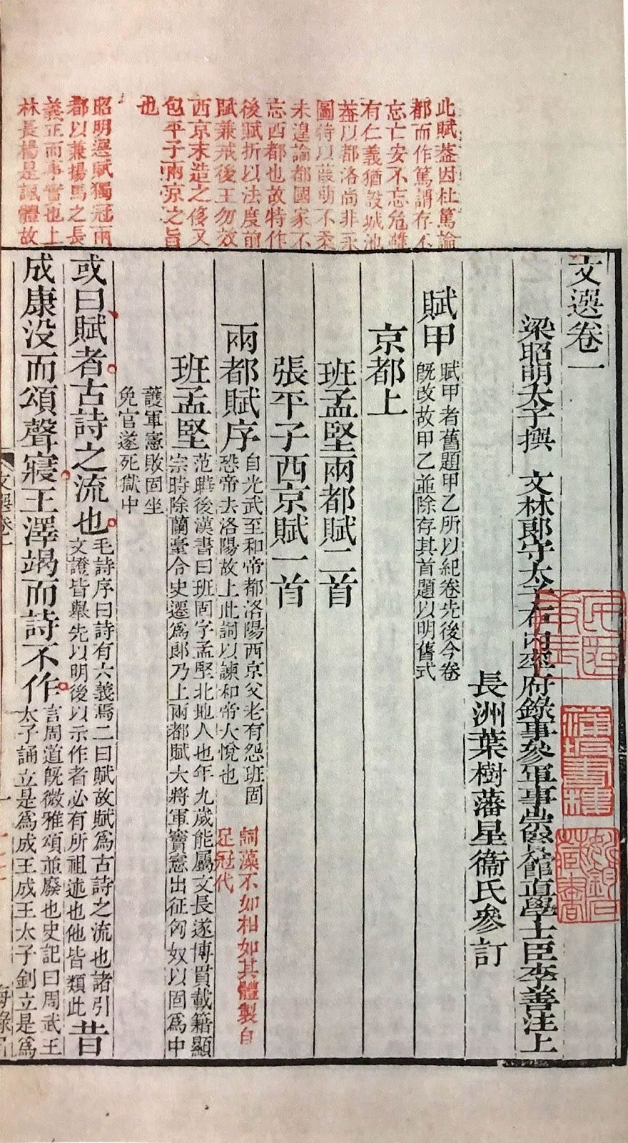
Additional comments were made in colors, sometimes to assist students studying for the civil service exams. Important passages were marked by circles (sometimes of different colors) next to individual characters. (Yinzong Wei, Scholars and Their Marginalia, 2022)

I don’t think I’ll be using signes-de-renvoi or Chinese-style colored tags, because I would like to focus my readers on the difficulties the character is having. There’s a delicate line between page formatting that is expressive, like Coetzee’s, and formatting that is distracting and done partly for the aesthetics, for example like Danieleswki’s—but that’s a subject for another post.
Both excellently summarized in Evelyn Tribble’s Margins and Marginality: The Printed Pages in Early Modern England (1993), which I’ll be citing in later installments.
I love finding entire essays of research of something I have never once given a thought about. What a fascinating, beautiful little niche of writing knowledge!!
Fascinating stuff. Meena Kandasamy incorporates something like this in her novel, Exquisite Cadavers, where the body of the text is the fiction, and marginalia describes the real-life inspirations for each section. Henri Michaux did something similar in Miserable Miracle to describe both the physical and the phantastical effects of mescaline. I love this parallelism either because of the old Rupert Bear annuals I read as a child, or it may be that I enjoyed the annuals because that method was already attractive for some reason. The Rupert Bear books had pictures, a straightforward body text, and also a rhyming couplet for each picture. I loved it.