

Experimental formats in fiction, 2: "Pull quotes," "Judas windows," and jalousies

I’m writing a novel in InDesign—that is, writing and arranging the layout at the same time. I’ve been researching the history of page layouts, not only in the current age of desktop publishing and its modernist precursors, but in various premodern and non-Western cultures. The idea is to repurpose complex layouts for use in contemporary experimental fiction. How, for example, can the rhetorical aims of medieval glosses be used for contemporary experimental fiction? How can InDesign and other current resources move the practice of the novel forward? Can multiple columns embody the postmodern interest in the divided self? Are nonfiction experiments like Derrida’s Glas related to the current concerns of fiction? Can it be useful to echo well-known page layouts like the Talmud or medieval commentaries in a contemporary text? Can marginal notes be an opportunity for the narrator to speak about their own text? How many voices can a page of fiction embody?
The posts are:
Adding pull quotes, Judas windows, and jalousies
Along the way I will offer critiques of formatted texts by Danielewski, Butor, Michaux, Schmidt, Fritz, Brooke-Rose, Derrida, Lebensztejn, and others. My interest here doesn’t include pages presented as images, as in concrete poetry and artists’ books, but rather pages where the formatting contributes to the meaning of the narrative. A formatted page, in this understanding, can be put into other fonts: what matters is the relation between the text elements—how they speak to each other and to the history of abnormally formatted texts.
Consider this sort of ubiquitous design feature:

The usual expression for this is pull quote or, for longer quotations, block quote. I’m not interested in them, because they’re designed to attract attention by teasing what’s in the body text. Historically, inserts like these have not been quotations from the body text, but comments on it. Jacques Derrida borrows from that history in his book Glas, but these are not quotes “pulled” from the text, but separate texts, spoken alongside and sometimes against the main text blocks.

He has a couple of intriguing names for these. He calls them “Judas windows”—those are the small windows in prisoners’ cells that let guards look in. The implication is that the Judas window surveils and perhaps controls what’s in the main text, or that whatever is written in the Judas window is a betrayal of the body text. He also calls them jalousies:

A jalousie, in French, is a shutter, the kind you can close to keep out the light, or open surreptitiously to peer outside. A jalousie blind, opened carefully between thumb and index finger, might let the main text peer out at the world. The voice I let speak from the jalousie might tell some secret about the main text that nearly surrounds it. The word, jalousie, is also the title of Alain Robbe-Grillet’s book translated as Jealousy. In that novel, a narrator consumed by jealousy stands outside the windows of his house, peering in at the man and woman he mistrusts. A jalousie might also be an obsessive observer of the main text, looking at just a part of it, like Charles Kinbote in Nabokov’s Pale Fire, poking around John Shade’s house.
For me these are great possibilities. I’m developing a voice that will speak in the Judas windows, commenting on the main text.
In Glas and in its English and German translations, the jalousies are in sans-serif font, making them look very different from the main text in the column. I won’t do that. The formatting is enough to signal a difference, and I’d like to make the proximity of the main text and its jealous commentary closer, more ambiguous. One of the reasons heavily formatted text is marginalized in serious fiction—Mark Danielewski’s books for example—is that when the formatting is too obtrusive, the novel becomes “experimental” in a pejorative sense, meaning that the aesthetics of the page design distracts and overwhelms the reading experience. In the case of jalousies and block quotes, the formatting is enough to signal a different voice: there’s no call for a different font.
There are many variations and different terms for these inserted texts, and I’d love some help. In French, a pull quote is a citation en retrait or an exergue—a word that has the benefit of also naming the place on the bottom of a coin that often contains the date, or the city where the coin was minted—so it’s not a commentary as much as a definitive label.
Marginal notes in Arabic are called هامشيات ḥamishiyyat, and in Greek (borrowed into Latin) scholia. The Latinate word in English, marginalia, is post-classical. They all live in the margins.
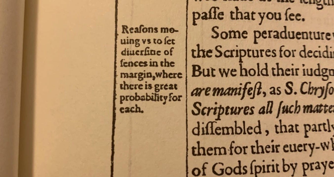
I’m also interested in formatting differences. Sometimes pull quotes are flush with the margin, but others extend into the margins. Is there a word for this difference? Is there a connection between the pull quote that lives partly in the margin—

—and the marginal note, which appears to have sprung entirely free of the main column?
Historically, glossae, running glosses in medieval manuscripts, predate notes that are half in and half out of the margin. But when did the change happen? Was it a Renaissance typographic invention?
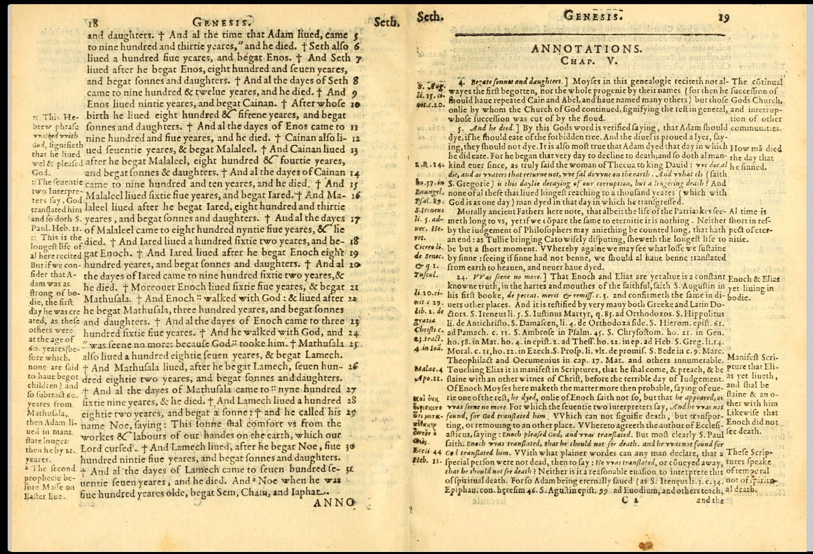
In the Douay-Rheims Bible the outside margins have commentary (in English) intended to help Catholics in England argue against Protestants. The inside margins on left-facing pages have verse numbers, and on the right cross-references. Everything is right justified, making for a very crowded look that wouldn’t be acceptable in contemporary typesetting.
In this decretal, the glossa ordinaria—the Biblical commentary—completely surrounds the poor body text.
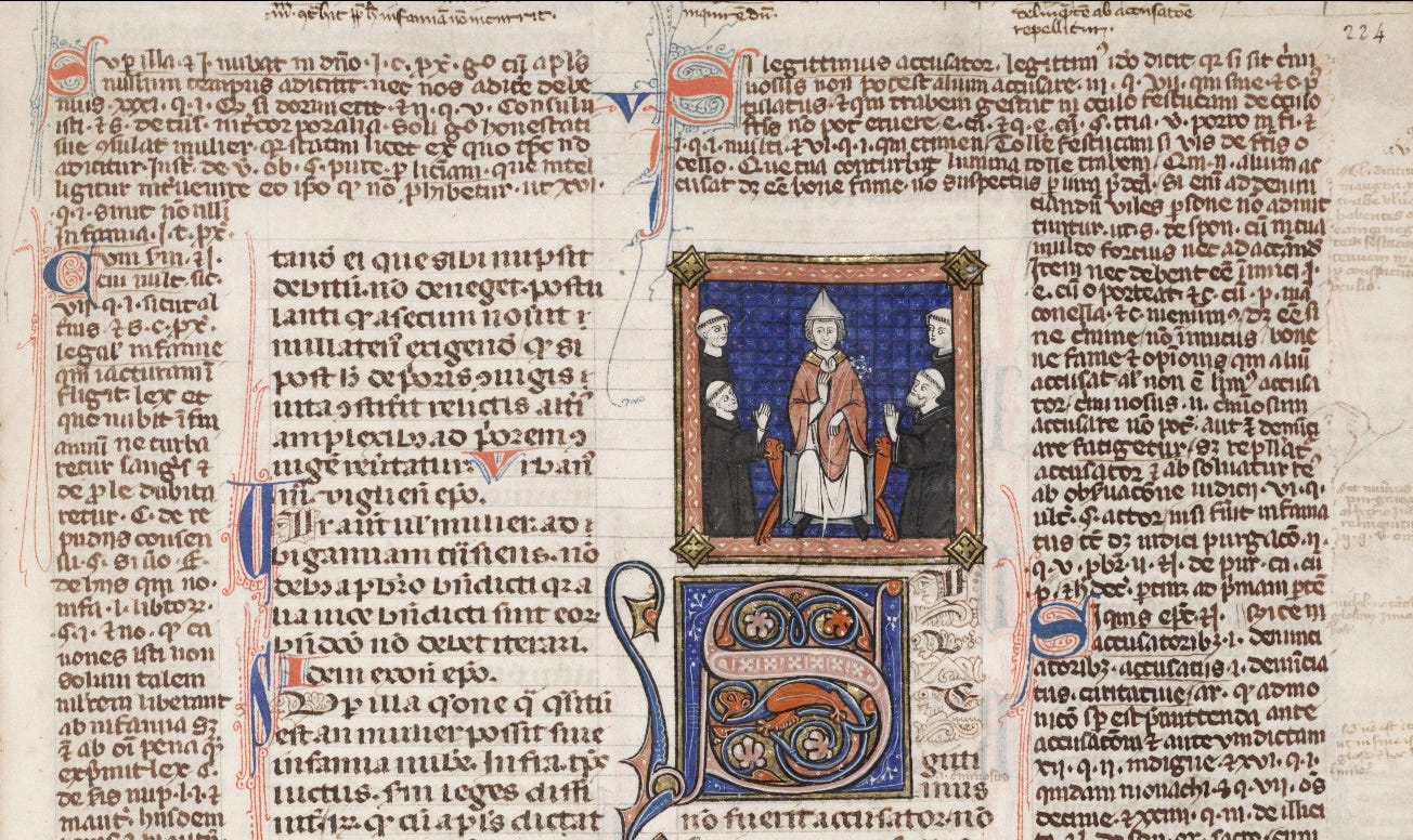
I’m thinking of this, too, for my novel. Wouldn’t it be interesting if the main story was squeezed out by marginal notes?
But all that is for the next post.
fascinating and tantalisingly physical too